Recommended Articles

Moving towards integrative oncology as a system of cancer care

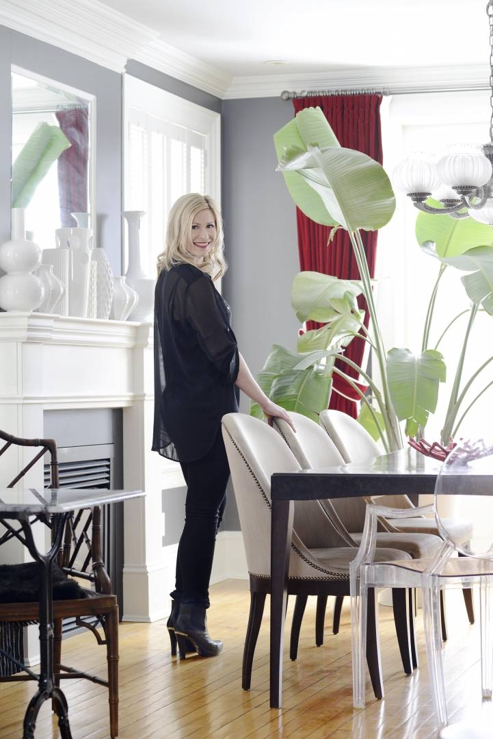
Wining and Dining at the Ottawa Wine & Food Festival


Located at the gateway to the Ottawa neighbourhood of Westboro, the newest boutique condo, The Azure seems to be the right cup of tea. While the first month of sales is usually slow for most developments of this nature, hovering at 10 per cent, a whopping 35 per cent of The Azure sales were made in the first month. The allure of the Azure is undeniable.
Showcased in the model suite is the London Classic, one of three European styled interior collections, a vision of Ottawa-born, lawyer-turned-developer, John Thomas.
As a tribute to this building’s British roots (the international award-winning PLP Architecture company from London), the London Classic was the first interior collection to reflect a sense of heritage, timelessness, and refinement. The hallmark of the London Classic collection is its herringbone patterns, cobblestone Carrera marble floors, walnut-dark woods, oversized hotel style pedestal sinks, 8” widespread lever faucets, framed door casings, post detailing, high baseboards, rain-head shower heads, black accents, lacquered wood cabinetry, and solid lever-style door hardware.
The kitchen reflects the look of classic cabinetry, unlike the typical flat panel door prominent in the current condo market. Shaker white cabinetry comes standard as part of this collection along with Carerra marble countertops. The Carrera marble from countertop to ceiling, serves as an interesting and decorative focal point, being seen from all aspects of the suite. Rather than fill this feature wall with a myriad of cabinets, a more design-savvy, less kitchenlike profile is achieved, perfect for high-style entertaining. Library drawer pulls and classic round doorknobs complete the look. Want storage? Be sure to notice the full-height cabinetry located opposite the counter stools upon entry into the suite. Not only does it provide a lot more storage but it dramatically increases the size of the overall kitchen footprint. This kitchen has far more places to put your things than the typical one-bedroom suite, even without the upper cabinets on the focal wall.
 Over-sized, black iron pendants, another nod to classic English styling, are from Progress Lighting. They provide much needed contrast to all the white and grey tones. The over-scale sconces in the bathroom also come from Progress Lighting. The power of lighting can never be underestimated in any space. It is worth the splurge whether in residential or commercial interiors.
The kitchen sink has a distinct square-edged profile to co-ordinate with the clean lines of the waterfall island countertop feature. The faucet style is a perennial favourite being the gooseneck by Aquabrass. It provides interest to this corner of the L-shaped kitchen layout.
Moving to the bathroom, cobblestone marble floors marry beautifully with the oversized 12” x 24” marble tiles in the shower. The Kohler Memoirs pedestal sink anchoring the large over-sized framed mirror set off by two sconce lights provides a lovely vista from the hallway. This sight line was not by accident. Details really count, especially in a smaller space.
The Phillip Stark toilet is located in a separate room, creating a dual purpose, a water closet for the main bathroom area and a powder room for the public main living space. It gives the effect of a grander suite and is more conducive to entertaining, providing the illusion that guests don’t have to share your private bathroom quarters. The clothes and laundry closets are modeled after a high-end Poliform one and provide lots of storage. The dark, exotic wood finish provides contrast to the white crisp finishes. With 25-foot wide bays and 9-foot ceilings offered in the one-bedroom suites and all of these beautiful features, it’s hard to believe that all this high style and quality can come without a London-high price tag. But it can at The Azure.

From its dramatic moody dining room wall colour and modern abstract art to its light-filled, south-facing kitchen and traditional butler’s pantry, this stately three-storey centre hall brick home in the Glebe is a study in contrasts: elegant and refined, but livable and modern for today’s busy family.
With a Georgian-inspired façade and accompanying brick carriage house, this charming family-style home was not as idyllic as it first appeared on the exterior, just over five years ago. The flow and functionality of the living space needed much improvement for a busy, large family. As a first priority, the clients opted to reconstruct their unfinished basement to include a full bathroom, guest room, office, exercise area, general media/entertainment room and a utility/storage area. After some time to enjoy their new living space and replenish their reno budget, they took on revamping the main floor of their home.
Considering the square footage of the house, the original kitchen was too small. It couldn’t fit more than two people in it any point in time. There was minimal storage space at the back entrance to the house and large rooms, that included two dining spaces, were underutilized.
The homeowners longed for a mudroom along with a larger, more functional kitchen with more storage while still maintaining the existing powder room, front entrance hall, dining and living rooms.
The new plan involved switching the existing dining room with the living room to afford the clients the desired mudroom accessible directly from the rear, garage area. As well, there would be a large, south-facing kitchen with butler’s pantry adjoining the dining room. Given there was a very large living/family room with television on another level, the clients didn’t mind scaling the main floor living room down in size from its original proportions. They wanted their new space to be cozier for family reading and intimate conversation. All of this was achieved with minimal change to the interior structure, except for a new beam installed between the new proposed kitchen and dining room. All of the client’s needs were met without a major “gut” job.
The custom kitchen was designed to integrate with the architecture of the house. Face-frame custom-lacquered shaker cabinetry with toe-kick valance detailing and glass inset panels, along with a furniture-style island in a contrasted custom-colour were details not to be compromised. The femininity of the jewelry-like crystal knobs on the doors offset the masculinity of the polished library pulls on the drawers. The backsplash in a small Carrera marble herringbone pattern ups the luxe factor, creating a classical tone for the kitchen. Perimeter counters are featured in a dark grey quartz, Caesarstone Concrete to balance the lacquered paint finish on the island. The quartz counters in Caesarstone 4600, on the island are to simulate, Carrera marble without the maintenance, critical for family living. The island pendants from Cyan Lighting, reference the crystal and chrome hardware while providing a dramatic focal point.
The butler’s pantry, just adjacent to the dining room, is a little gem allowing for bar service with the sink and wine fridge. It accommodates all items used for entertaining such as bowls, serving trays, tablecloths, china, silverware, and glassware.
The dining room (pictured on page 32) is rich and luxurious and darker, offering a contrast to the light-filled kitchen. The Louis-style dining chairs upholstered in two fabrics, a modern black and white floral and a geometric white and black honeycomb, were sourced from C&M Textiles. The dining table and chairs are a custom, light grey stain. The walls are painted, Benjamin Moore, Chelsea Gray, serving as the perfect backdrop to Ottawa artist, Heidi Conrod’s light abstract. The gorgeous Oly chandelier from Shop 219 tops the list of features with its hand-blown orbs of glass.
The mudroom is personalized to the client’s children. There is a dog bath, chalkboard painted door, a fun wall colour in Farrow and Ball Blue Ground, and decorative but practical cabinetry to allow airflow for sports equipment.
The living room is an invigorating and happy space, contrasted with the feeling of the other main spaces yet cohesive with the overall colour scheme. Why shouldn’t a home reflect the ever-changing moods and lifestyle habits of the people who inhabit them? The light, turquoise walls create a soothing effect but when paired with yellow-green accents, the space comes alive. The sofa was custom designed in a neutral sand-coloured velvet while the other two chairs were vintage, bought online through used goods groups. The wing chair was re-upholstered in a white ultra suede while the other was fashioned in an all-time favourite designer-patterned linen, Imperial Trellis by Kelly Wearstler. The taffeta-lined striped drapes are a combination of the signature colours made by C&M Textiles.
All elements of the design, layout and flow of this house and the décor, colour palette and amenities of this house exude a fresh elegance and playful sophistication, accessible for family living.

Designed originally for city privacy in the 1960s, this Alta Vista bungalow is best suited for display of an extensive art collection with its expansive walls, high ceilings, and minimal trim work. Original owners were the late Samuel and Caroline Baylin, who were a family of artists, she a painter and art enthusiast and he, an ornamental metalworker and designer involved in his father, Max’s company, Ottawa Iron Works Ltd. * By 1950, Ottawa Iron Works Ltd. was one of the most modern architectural metal plants in Canada.**
The home sadly fell into disrepair over decades with renters and multiple haphazard renovations, so when the most recent homeowners approached me to help reconstruct this house to their liking, it seemed like a tall order especially with the history behind it and a modest budget to work with. Instead of trying to strip everything out to suit the client’s tastes or bring back some of original aspects, like wood wall paneling in the family room, we prioritized our efforts. The flooring that had been changed over the years created uneven breaks across rooms that were open to each other, being somewhat of a distraction to the room’s clean architecture. Therefore, the first priority was to unify the flooring to make the public spaces feel more cohesive. The whole house was repainted, stipple ceiling removed in the common areas, and all the white melamine doors that were not original to the house were replaced with solid core hardwood doors stained to match the wood ceiling beams original to the house. The small master bath and closet area not only had to be refreshed for hygiene purposes but function, light, and flow needed to be improved to reflect the expansive feel of the house.
The existing wood beams had weathered over time with sun damage and the existing stain had become an odd orange colour so we decided to re-stain all the wood an espresso brown colour (the client’s favourite wood stain) to add a more sophisticated contrast to the vanilla walls painted Farrow and Ball, Slipper Satin. One of the few original aspects of the house still existing, the fireplace brickwork (see photo on page 39), seen upon entry was left as is to reinforce the mid-century vibe of the house. Victorian and Tiffany-style stained glass light fixtures were exchanged for mid-century reproductions, like the Sputnik hanging pendant, from Mikaza Home, to emphasize the simple modern lines of the house.
The most striking change occurred in the principal bedroom. The existing ensuite was very small and had carpeting in it while the closet was dark and not configured for functional clothes storage. To improve flow, symmetry and light, the non-load bearing wall between the bathroom and the closet was removed and another window was added to mirror the existing one to the left of the shower. A central access to the ensuite from the bedroom was created with two double doors in lieu of the 2 separate single doors. The outer walls of the bathroom and closet did not change, however, in removing the interior wall separating both rooms, the new space appears dramatically larger. The “floating” shower serves as a focal point upon access to the bathroom and divides the closet area from the vanity/toilet area. Using glass on three sides of the shower visually doesn’t command space. The wall tile selected in a linear pattern, was chosen to blend with the tone of the floor tiles and wall colour, Farrow and Ball Pavillion Gray, creating a more expansive effect. 12” x 24” striated matte grey tile replaced the carpet and a larger more modern furniture-style vanity with two rectangular vessel sinks improved storage capacity from the former one that was built right up against the wall with a vertical laminate 6” backsplash on two sides. The closet doors and drawers were custom-made to mimic the slab door vanity design. A double-door closet for him and one for her along with an extra single-door closet and set of drawers was more functional than the offerings of the previous layout. Dresser-style nightstands and a high boy were situated in the bedroom for extra storage should the clients’ require it.
 The last area to receive a face-lift was the basement bar area. The bar wall was tiled from counter to ceiling with a linear grey/white marble consistent with the aesthetics of the bathroom wall shower tile. A new, thicker square pencil edge stainless steel-like Formica replaced the ¾” Ogee round cream-coloured Formica one. The bar base was left as original but stained a dark espresso colour to match the rest of the woodwork and beams.
This project is a great lesson in how to achieve a dramatic transformation without breaking the bank or making major structural changes. New flooring to connect all of the open rooms and a fresh coat of paint were key. Working with existing features such as the ceiling wood beams and fireplace brick work and putting back features that would have been original to the house such as wood slab doors were not only budget friendly solutions but preserved some of the home’s original charm. This Alta Vista bungalow once again feels like a modern art gallery, just as it did many years ago with its original owners.
Visit Tanya’s website for a complete look at her work with Ottawa Life Magazine.